Not every point on a model needs to be specially designed tactilely; for example, for corner points on pyramids or cubes, there is no need to mark the points in addition to the designation. However, for some highlighting it is necessary to place points on surfaces.
Standard representation
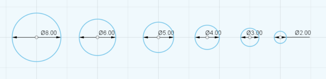
Simple points are best implemented with an extruded semicircle. The size should be chosen according to the context, but it should differ significantly from the size of single braille dots and therefore the diameter should be at least 2mm.
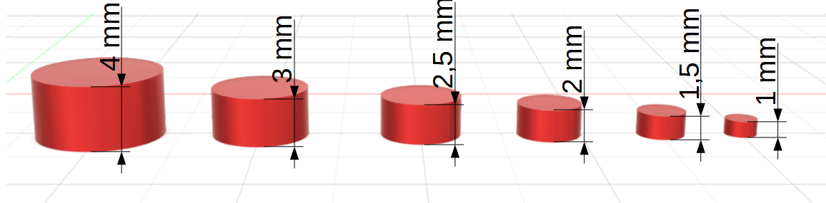
The extrusion should be chosen depending on the dot size. For optimal rounding, the extrusion should be equal to the radius or half of the diameter.
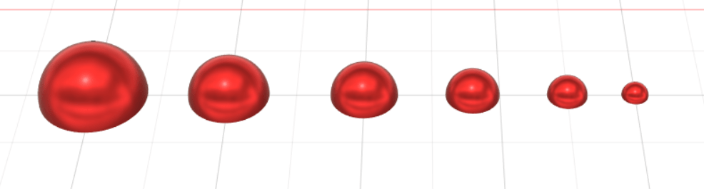
Then perform a rounding with the height of the extrusion.
The extrusion height is equal to the radius of the circle (half of the diameter), but a lower height can be used (e.g. 25% ).
For rounding, the radius is the same as the radius of the base circle.
The distance between points and other symbols should also be considered. According to Beyer, “the distance between parallel lines and between point symbols should be at least 4mm” (Beyer 1995, p. 34).
Different types of points
Depending on the model, different types of markers are needed to clearly distinguish points from each other.
This distinction is created with a clear difference in size (at least 30%) or different design forms.
Circular ring with dot in the centre
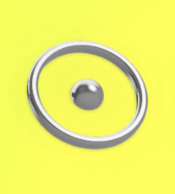
During testing, the following criteria have proven to be crucial:
– the inner radius of the circular ring should be more than 2.5mm larger than the radius of the dot in the centre. The radius of the point chosen was 2-2.5mm.
– a circular ring with a thickness of 0.75mm was preferred.
– the extrusion height should be between 0.6 and 1mm.
The difference between the height of the point and the ring should not exceed 0.3mm. A preference regarding heights (ring higher, dot higher) could not be determined.
Overall, many variants were found to have good tactile discrimination.
Cross

Thin lines provide a clearer tactile image and a thickness of between 0.6-1.1mm is recommended.
The line length should not be too small (at least 1cm), otherwise tactile recognition as a cross is difficult.
A subsequent rounding off makes the tactile image more pleasant to the touch.
Printing orientation
Vertical printing should be selected if possible, as the tactile quality of the dots is significantly better.
If horizontal printing cannot be avoided, keep the rounding slightly smaller than the radius so that there is no “peak” at the top of the point. For example half the radius could be chosen for the rounding.
References
Beyer, Martin (1995). Aspekte der Gestaltung und Herstellung taktiler Medien anhand ausgewählter Beispiele. In: Wilfried Laufenberg, & Jürgen Lötzsch (Hrsg.): Kolloquium über tastbare Abbildungen für Blinde. Marburg: Deutsche Blindenstudienanstalt