The problem of abstraction
Illustrations and models can be abstract and unfamiliar to visually impaired learners who usually do not immediately notice a correlation between the real object and the complex illustration of the object.
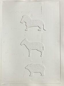
This is especially the case with 2.5D images drawn in outline from a side view, for example animals or plants. These projections may be understandable for sighted people – even children draw animals in this way – but for visually impaired people they usually are not.
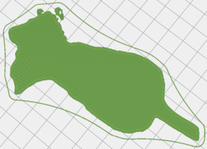
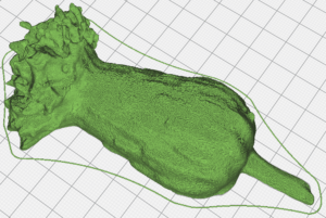
The following example shows a thistle. The original cannot be reconstructed from the projection.
The visual perception of sighted students is primarily focused on the shape and the outline of the object. However, the perception of visually impaired learners focuses first on spatial dimensions rather than on the outline. If the model neglects the third dimension to such an extent that only the two-dimensional structure is perceived, then it is difficult to establish a correspondence between the real object and its representation. Therefore, these visually imagined forms of representation are much more difficult for the visually impaired learner to intuitively and independently understand.
It is also important to recognise that differences in size or texture between the real object and model or illustration may also cause issues with correspondence. This problem is difficult to solve. Nevertheless, you should be always aware of it.
Reducing complexity
Reducing complexity means reducing the amount of information in a presentation in order to avoid information overload.
This reduction is essential in the production of tactile illustrations and models. Complex illustrations can lead to overload and rejection. Reduction to the essentials is probably the main requirement for tactile media. However, generalisations should be avoided here because the content of information in a presentation depends on what is to be taught and to whom. For visually impaired learners with little experience of handling tactile illustrations and models, it can help to impart the information and labels over the course of several models with increasing content, at the same scale. The reduction should therefore not only include the information presented in the model; the handling should also be made as simple as possible.
Format/Scale
Within the field of education for the visually impaired there is agreement that the size of a tactile illustration or map should be limited to the so-called “hand tactile space”. This means that a model should be able to be easily held in both hands.
According to the German Federal Institute for Occupational Safety and Health, the hand tactile space of an “average” adult is approx. 30cm × 40cm in portrait format. However, imposing a fixed limit to this size is not realistic. In special cases the model size can be increased to fit the arm tactile space. As a side note, the hand tactile space is a good match to the design of many 3D printers, where the build volume is roughly equivalent to this size.
According to the same institution, the arm tactile space, i.e. the left and right one-handed area is approx. 40cm × 100cm in landscape format.
At the same time, it must be ensured that the model and the details are large enough. All relevant components of the model have to be explorable with the fingers.
Superelevation in tactile illustrations and maps in education for the visually impaired
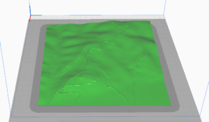
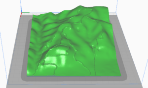
Height is a special type of linear scale. It also refers to a distance, but to the distance in the vertical plane. In relief models the height is often represented in a different scale to the length. The ratio of these two scales gives the superelevation factor.
Unfortunately there is no uniform standard value for this superelevation factor. This is because it depends on the scale of the map and the real elevation conditions.
As a guideline, the superelevation factor can be given as 3. The z values (heights) are thus represented three times as high as the scale in the horizontal plane would actually require. This enables many details of the landscape to be detected, which would not be the case without superelevation.
Superelevation, however, always carries a risk: mountains appear steeper and higher. Therefore, the superelevation factor should always be chosen carefully.
The risk in using visual images as a basis for tactile illustrations and models
In the design and production of tactile 2.5D illustrations and maps, there is often a risk in using visual images as templates.
Unfortunately, even after many years of relief design practice, optical perceptions and visual abstraction habits are still often transferred to the relief due to the predominance of the visual sense.
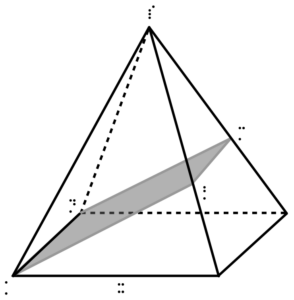
A typical negative example is the drawing of an oblique image to represent a three-dimensional original. This works very well for sighted people and is used in many situations in the classroom. If this type of presentation is used in a 2.5D representation, it is totally inaccessible for visually impaired people. The representation of three-dimensionality by edges running diagonally backwards is purely visual, which is why such a representation should never be used for visually impaired learners under any circumstances.
The graphic shows an oblique image of a pyramid with a plane drawn in. This representation is not accessible for visually impaired learners.
Labelling and orientation
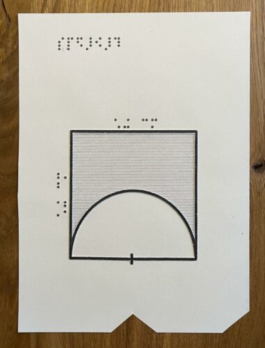
Due to the difficulty of recognising tactile illustrations, braille labelling is often useful. However, you should be brief and only label things that are really necessary because labels can also distract VI learners during their exploration of the model.
A description of the image in text form or a key can also be very helpful. A key is usually included on a separate sheet attached to the map or model. An image description can either be printed on paper in braille or can be provided as a digital file.
For 2.5D illustrations or maps, a marker is necessary to indicate the correct orientation of the illustration. Often a corner is cut off for this purpose or a notch is inserted in the centre of the bottom edge. Whichever option is chosen, it should always be the same, so that it is clear in which position the image must be rotated.
Do’s
- represent surfaces as surfaces, shapes as shapes, and lines as lines
- make figure-ground distinctions (differentiate objects from background by using tactile structures)
- models should be viewed individually and adapted to the age and previous experience of the students
- reduce model complexity to include only key features. Incidental and unimportant details should be omitted
- the materials should have a clear “tactile contrast” so that different lines, points, hatchings etc. can be clearly differentiated from each other
- in the case of complex subject matter, several representations with different content emphases can be used
- any symbols inserted should be used as consistently as possible
Don’ts
- objects should not overlap (i.e. be partially obscured, “in front and behind”)
- do not bring lines too close together because they quickly give the impression of a closed figure
- do not use visual images that are exclusively accessible by sight, e.g. sun rays, candlelight, water waves, clouds etc.
- do not exceed the size of the user’s hand/arm tactile space
- do not transfer visual images 1:1. Models for visually impaired learners often look more different than sighted people would imagine
- do not use distracting fonts. Braille should be used with restraint
- do not interrupt lines (often done with braille – see below)

